Launching a new line of business
Refinance your car loan with Chase
Comapany
Chase
DATE
Nov. 2024 - Feb. 2025
TL;DR
I was the lead designer and UX point-of-contact on digitally introducing car refinancing for customers who could benefit from better terms. I partnered with product, marketing, and legal teams to create a ecosystem that allows customers to discover refinancing, evaluate whether it’s right for them, and start an application.
Our goal was to double the revenue of our auto loan business. An MVP was rolled out to the public on May 21st, 2025 and can be found in Chase offerings now. We're on track towards our goal, generating an average of $6M/month from refinance customers.
Our goal was to double the revenue of our auto loan business. An MVP was rolled out to the public on May 21st, 2025 and can be found in Chase offerings now. We're on track towards our goal, generating an average of $6M/month from refinance customers.
The problem
Hopeful customers are being turned away from better rates
Over the past few years, many people took out car loans with high interest rates due to post-COVID inventory shortages. Now that rates have dropped, many want to refinance to lower their payments. However, Chase Auto does not offer refinancing. People also seek to refinance after life changes such as marriage, having a child, or retirement. Over 2,000 customers call in every month asking if they can refinance their loan with us, to whom we have to say “no."
The goal
Launch refinancing and double our revenue
By beginning to offer refinancing, we're aiming to earn $1.5B annually from new customers. My goal is to design an ecosystem that allows customers to discover refinancing, evaluate whether it’s right for them, and start an application.
The FIRST STEP
Mapping the new ecosystem and defining deliverables
I collaborated with the marketing and development teams to define how we can integrate the key moments of refinancing into our existing digital structure. This allowed me to define our deliverables and scope the project timeline.

For deliverables designed from scratch, I created info architecture by questioning:
Vague requirements
Example: What types of special offers do we expect?
Technical feasibility
Example: Will we know whether the customer has already submitted an application? What about whether they’ve gotten a decision?
Edge cases
Example: Could the customer start a new application once they have already submitted one?

I iteratively moved up fidelity, socializing the work at each step
I posed considerations about content amount, design system patterns, and technical requirements to guide myself and the cross-funactional team towards a final solution.
First wireframe, Refinance Info Page

Final, Refinance Info Page

Some existing experiences needed updates for the expanded scope. However, could I fix their lingering UX gaps at the same time?
Payment estimation tool (desktop web)

A
Main goal - Integrate refinancing payment estimation
B
Minor issue - Headline loses meaning after customer’s first use
C
Major issue - Previous results do not auto-update or disappear when inputs are changed
D
Minor issue - ‘Apply now’ can be mistaken for submitting an application rather than starting one
Payment estimation tool (mobile web + app)
E
Minor issue - Headline hierarchy is different in mobile than in desktop
F
Major issue - ‘Edit info’ button gets missed and feels out of place

Updates made (desktop web)
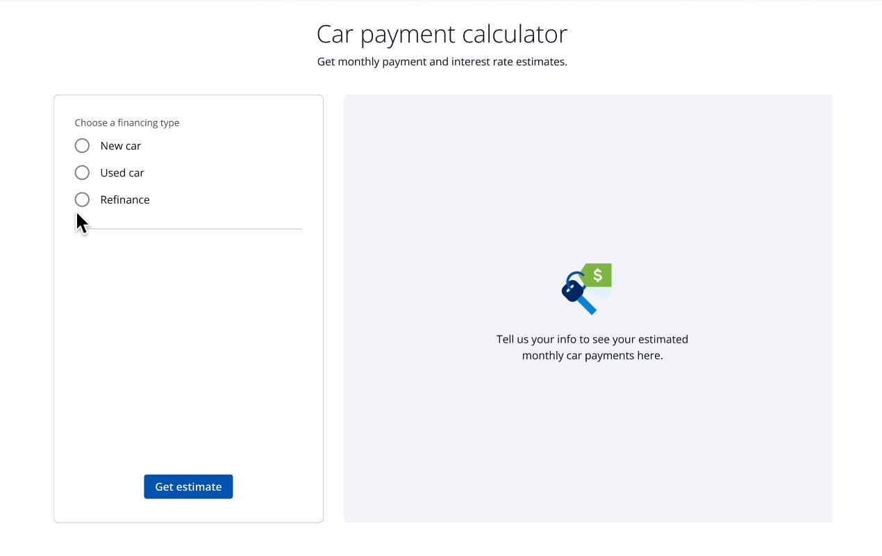
- Refinancing estimation integrated
- Heading and subheading content updated to retain meaning throughout tool use
- Previous results are removed and the most relevant call-to-action ("Get estimate") is re-surfaced when a user changes their inputs
- "Apply now" button updated to say "Start application" for greater specificity
Updates made (mobile web + app)
- Headline hierarchy updated to be consistent with desktop web experience
- 'Edit Info' button added to the sticky footer to increase discovery of this option (the tradeoff is that increased sticky content decreases accessibility)

I ran fast and focused testing to finalize decisions
To persuade the product and dev teams to implement different solutions than they expected, I wanted to clearly demonstrate the value of the proposed updates. I planned and launched quick unmoderated usability research. When conducting evaluative testing, I like to define focused learning objectives, build a prototype tailored to those goals, and dedicate time to thoughtful synthesis. This study also allowed me to refine the designs slightly and surface opportunities for future improvements. You can see my full share-out here.


Full solution
Contextual advertisements and entry points
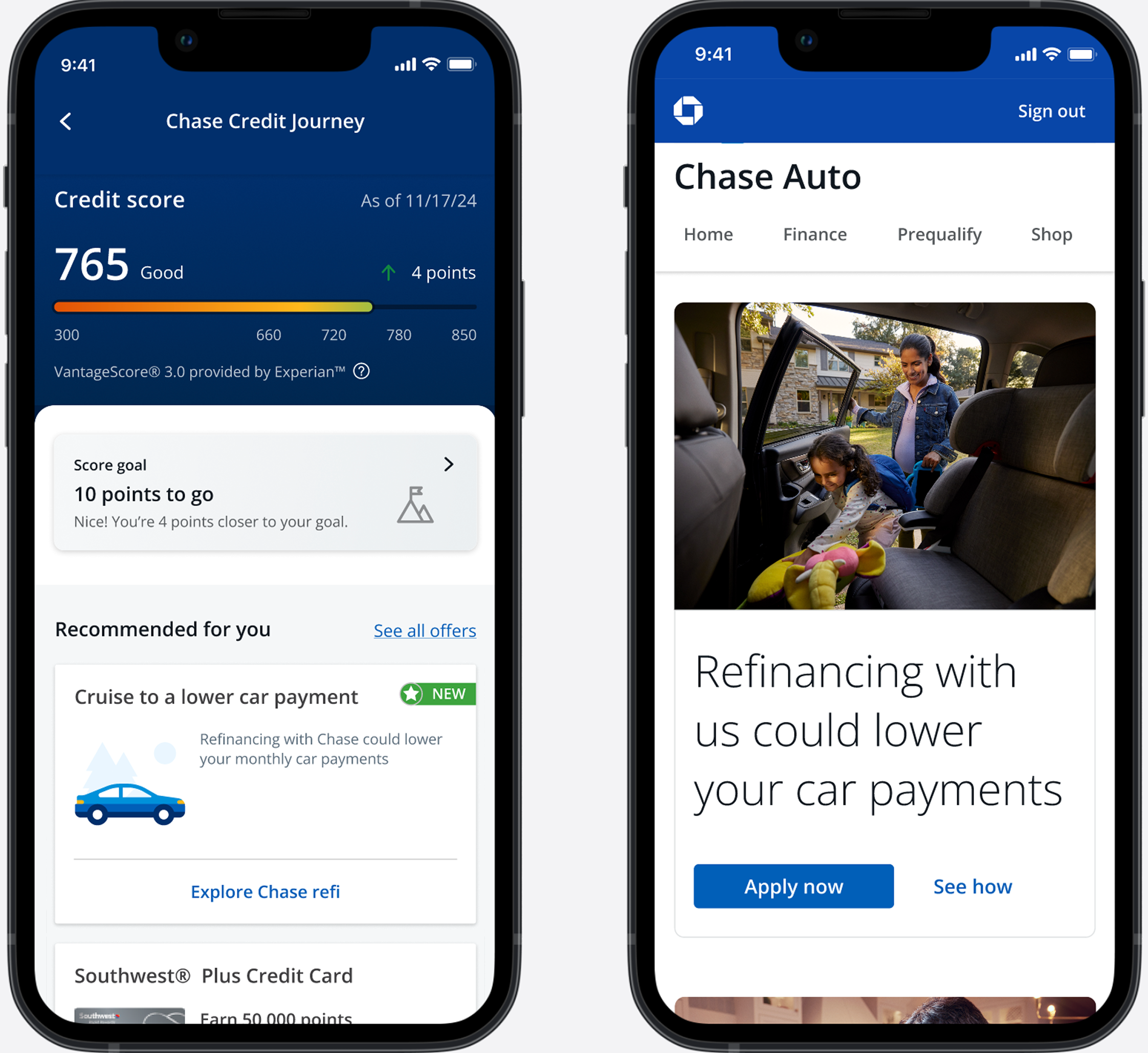
- Span across signed-in and signed-out experiences
- Surfaced to customers who can benefit from refinancing
- ‘New feature’ treatment used where possible
Preparation and expectation setting

- Dedicated page for the customer to start at and return to at any point in their journey, process of refinancing explained
- Customers can calculate how much they could be paying if they refinanced
- Several prompts to start the application
Collaboration on application and post-application process

- New financing and next steps are surfaced to the customer after approval
- Smooth process from discovery to approval due to close collaboration with the application design team
Design handoff
I make it a point to consider diverse ways of experiencing a design — like through a screen reader — as I work. At handoff, I outlined accessibility specifications such as heading order, alternative text, and tab order. I also wanted to proactively address any questions the developers may have by writing interaction and component notes. Most importantly, I nurture my relationships with developers and maintain close communication through the quality assurance process.

Since launch, this has generated $18M in revenue
We launched this MVP of refinancing on May 21st, 2025. As of August 21th, there have been about 90k applications started, more than 36k apps completed, more than 12k approvals, and 600 bookings. This equates to over $18 million in originations, putting us on track for our revenue goals. Since MVP launch, the team and I have worked on further improving the refinancing experience for customers. We're making pre-qualification tools accessible for refinancing, boosting visibility of refinancing in our navigation, and creating personalized nudges for people that could most benefit from refinancing.
Reflection
Before I started this role, I largely focused on making the best products. However, I didn’t pay much attention to the design of how we’ll get people TO the product. By working on launching a new business line, I’ve learned that product design and marketing aren’t separate forces, but rather need to work hand-in-hand to meet the discovery and engagement needs of an audience.
As always, exposing team members to design iteration, testing, and tradeoff consideration was enjoyable and I’m grateful for the people who trusted me to run this working model. With our solution, I'm thrilled that people who have been stuck with high interest rates are getting some relief.
As always, exposing team members to design iteration, testing, and tradeoff consideration was enjoyable and I’m grateful for the people who trusted me to run this working model. With our solution, I'm thrilled that people who have been stuck with high interest rates are getting some relief.